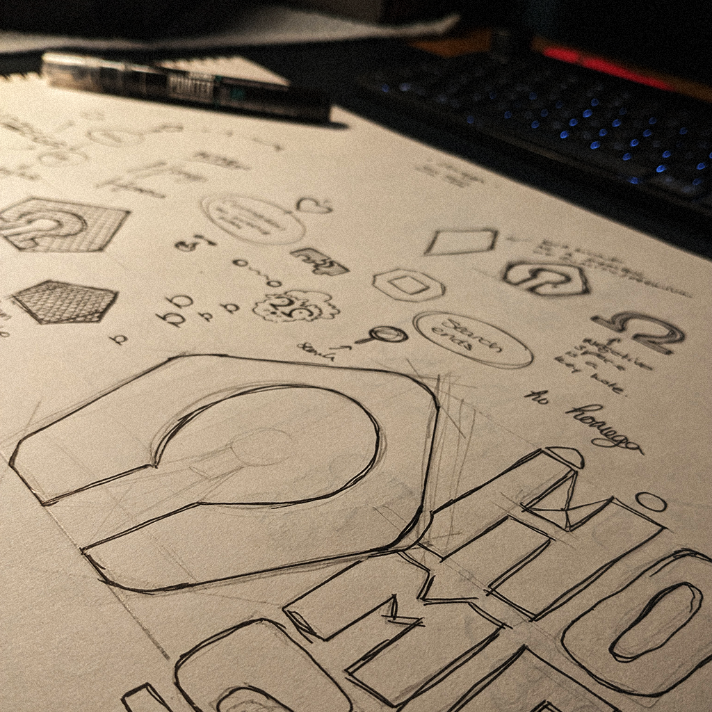
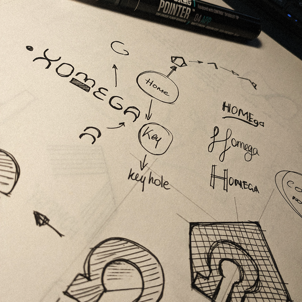
The identity that evolved with the brand
Homega isn’t your normal short-let company. It focuses on ensuring a high-end experience, starting from the furniture quality chosen for the apartments, to a full team of people whose main goal is to make the guests’ stay seamless and unforgettable. Homega wants guests to never think twice about where to stay the next time they visit Malta.
Homega started off in 2023 as a real-estate website, and the initial branding was designed around that, always with the idea of a brand that exudes calmness and seamlessness. This was the challenge: to create a brand identity that felt robust but could live in the background to allow the properties to shine.
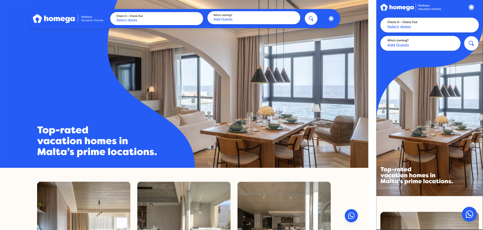
Fast forward a couple of years, Homega transformed into a short-let brand with over 12 apartments around Malta, and more on the way. While the logo, typography, and colours stayed the same, other elements of the branding had to evolve for the new direction, with more features that helped support the short-let industry.

The visual identity that followed & grew
With the transformation of Homega, the visual identity had to evolve with it. While maintaining the brand’s core visual elements, we created new designs and illustrations to help elevate the experience at Homega. We thought about all the things required for a great short stay.
To bring this new direction to life, we couldn’t rely only on the logo; we needed an identity that feels personal, clean, and charming.
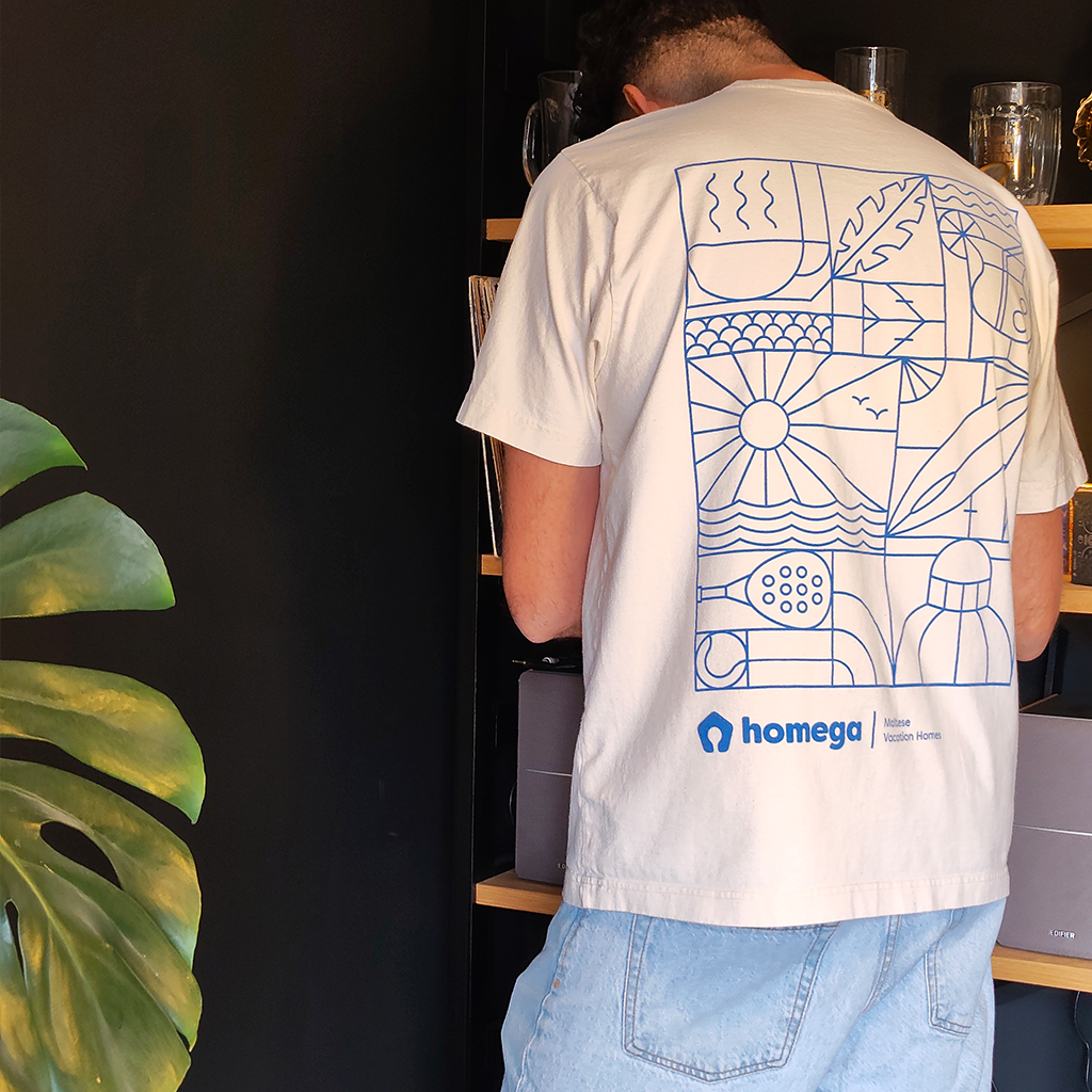
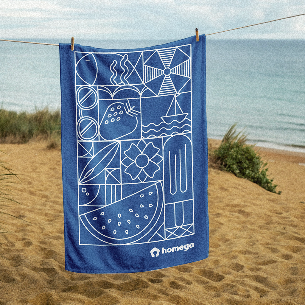
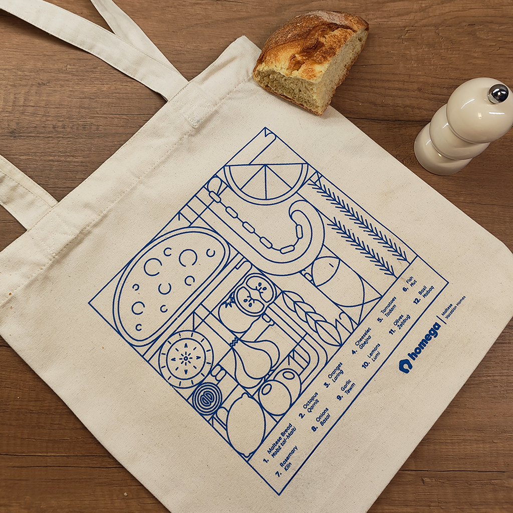
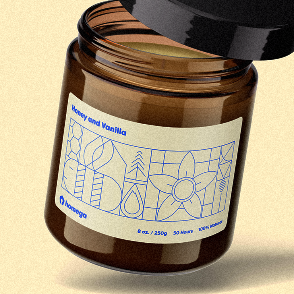
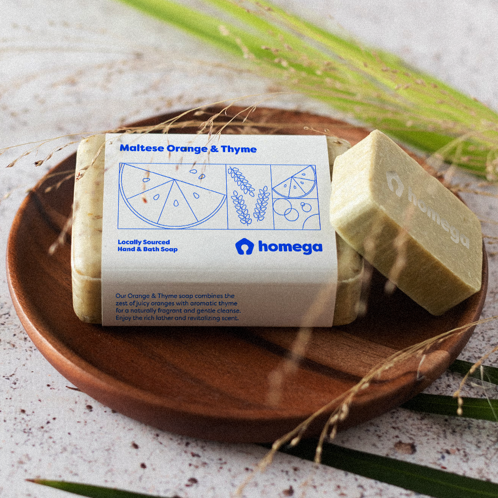
The illustrations are the product of a well-thought-out process that aims to mimic the service Homega provides. The linear style and continuity between the various sections of the illustrations reflect the seamless process and experience Homega offers its guests, while taking elements of Malta into consideration. In some cases, the illustrations are also influenced by the product on which they appear.
For the t-shirt and the guest book, I designed illustrations that are a bit more generic and reflect Malta and the vacation vibe. The illustrations on the towel take inspiration from elements one might find at the beach. The tote bag, which can be used for grocery shopping, features illustrations of traditional Maltese food with the names in Maltese at the bottom. Finally, the candle and soap designs reflect their specific scents, showing bees and flowers for honey and vanilla, and orange slices and thyme for the soap.
It dones't stop here...
I am continuously working with this brand, helping the identity evolve and shape itself around the services it wants to provide. I take great pride in directing this identity to make sure it shines above the rest and allows it to reach the standards that the Homega team offers.